As mobile devices getting popular and common for business users, we have responsive web version of our online demo available for public evaluation. It is specifically designed for mobile screens, namely smartphones and tablets.
With responsive web design, our solution will always automatically adjust according to your screen size. As a result, it always makes sure everything will just show nicely and neatly on the whole screen. Now life is even easier when you are on the go.
There is no need to install any mobile apps on mobile devices. Helpdesk is at your fingertips on any mobile devices, just open up any mobile browsers, for instance Google Chrome, Firefox, Opera, Dolphin etc. No hassle about what Android versions or iPhone models are compatible!
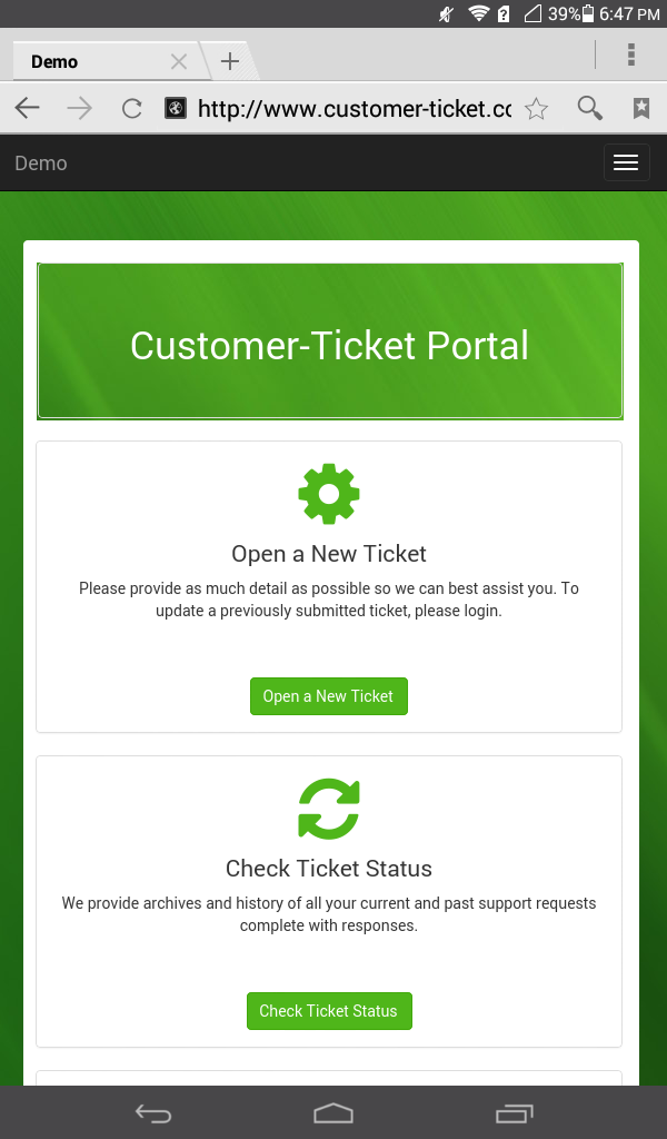
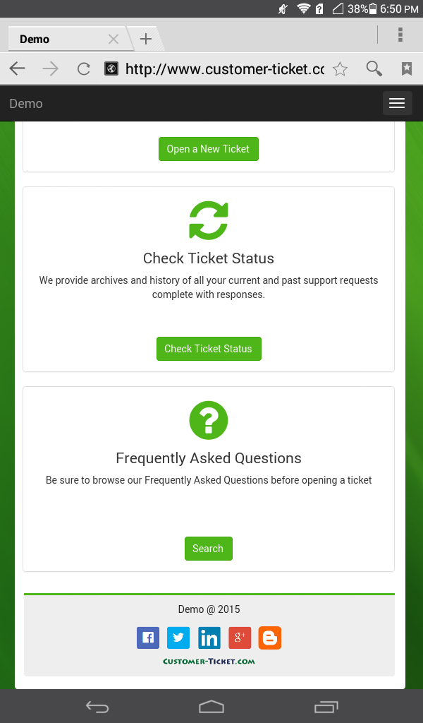
Below show you some screenshots of the mobile web displayed on a 7″ Huawei tablet. It fits just perfectly for any size of screens. It shows the one-stop web portal for our ticket helpdesk solution. This is a central access point where key functions are available.
To have a walk-through of the key functions of “Open a New Ticket” and “Check Ticket Status”, please check out our previous blog post at the below.
To take a Live Preview at the responsive web of our ticket helpdesk solution, please click below: